


December 23 キャベツ頭の中身、パート2 The Inside of a Cabbage Head (Part 2) [モノ goods]
December 23, 2008 (Tuesday)
「December 16 キャベツ頭の中身 The Inside of a Cabbage Head」のもしかしてパート2です。
いくつかの会社が、営業用に同じデザインのトレードカードを使用していたことが了解されました。ブログのスキンのデザインとブログの関係みたいなもんでしょうか(ちがうか)。
このあいだ買ったChaim M. Rosenberg の Goods for Sale: Products and Advertising in the Massachusetts Industrial Age 〔『商品――マサチューセッツ産業時代における製品と広告』〕(記事「December 9 Eyewitness Books のNorth American Indian ほか2冊」参照)には、リソグラフの導入とトレードカードの発展について解説がありました。――
Advertising took a great leap forward with the introduction of lithography. A book published by the Boston Anthenaeum (Pierce & Slautterback 1991) lists over one hundred large and small lithographic companies active in Boston during the period 1825-1880. Springfield was the home of the Milton Bradley Lithographic Company, and other towns had their own lithographic companies. The many advertising firms give testimony to the commercial opportunities then available in Massachusetts. The lithographers met the needs of their clients for portraiture, drawings of homes, businesses, and factories, views of towns, book covers, and for product advertisements, including trade cards. The lithographic companies produced stock trade cards with blank spaces for the business to print its particular message. A smaller number of the cards were designed specifically for one enterprise. 〔大意―1825年から1880年のあいだにボストンでは大小100を超えるリソグラフ会社があった。リソグラフ制作屋はポートレト、風景、ブックカバーなどさまざまの需要にこたえたが、商品の広告をトレード・カードを作成して行なったりもした。会社の社名とメッセージの文字を入れる余白を残した出来合いのカードを制作し、また、それよりは少なかったが、特定の業者の注文に応じて独自のカードを作ったりもした。〕
The trade cards were multicolored and aimed to catch the eye. Some were elaborate minor works of art. Many feature the innocence of young children, a common Victorian theme also seen in the photographs of the Liddell sisters by Charles Lutwidge Dodgson 〔ルイス・キャロルのことです〕, better known as Lewis Carroll, the author of Alice in the Wonderland. Some of the trade card illustrations were crude caricatures showing black and Asian people as servants and objects of ridicule. Among the artists drawing the trade cards was Boston-born Winslow Homer, who served his apprenticeship at L. Prange & Co. of 159 Washington Street. The young Childe Hassam, whose later Expressionist-style paintings captured the mood of later-nineteenth-century Boston, also learned his craft at one of the Boston lithography shops.〔大意―トレード・カードは多色刷りで、目を引き付けた。芸術作品と呼んでいいものもあった。多くはヴィクトリア時代によく見られるような、無垢な子供を描くものだったが、黒人やアジア系の人たちを戯画的に扱ったり、嘲笑の対象にするものもあった。トレード・カードをつくった版画家のなかには、ボストン生まれのWinslow Homer や、のちに表現主義的な絵を描いたChilde Hassam などがいた。〕
Among the best-known Boston lithographers was John Henry Bufford, born in 1810 in Portsmouth, New Hampshire, the son of an ornamental sign maker. Buffrod served his apprenticeship with William and John Pendleton of Boston, who started America's first lithography company. One of his fellow trainees was Nathaniel Currier, born in Roxbury, Massachusetts. Currier left Boston for New York, where he started what was to become the country's greatest lithography company, Currier & Ives. In 1835, Bufford went to New York to work for Currier. Five years later he returned to Boston and started his own firm on Washington Street. In 1865 his sons Frank and John Jr. were made partners, and the firm became known as J. H. Bufford & Sons. Bufford remained the most prominent lithographic printer in Boston until his death in 1870. His sons continued the business as Bufford Sons Lithographic Company. It was this company that produced many of the trade cards for Massachusetts-based businesses from 1870 to 1900, including Lydia Pinkham Vegetable Compound, New Home Sewing Machines, Gilt Edge Shoe-Gloss, and Ivers & Pond Pianos. 〔大意―ボストンのリソグラフ制作者で有名なひとりがジョン・ヘンリー・ビュフォード (1810-70)。ニューハンプシャーの装飾看板屋の息子に生まれたビュフォードは1835年にニューヨークに出て、アメリカ最大のリソグラフ会社カリアー・アンド・アイヴズをつくったナサニエル・カリアーのもとで働いた。5年後にボストンに戻り、自分の店をワシントン通りに開いた。1865年、ふたりの息子フランクとジョン・ジュニアが共同経営者に加わり、会社はジョン・H・ビュフォード・アンド・サンズとして知られるようになる。息子たちは父の死後、ビュフォード・サンズ・リソグラフィック・カンバニーとして事業を続けた。1870年から1900年にかけて、マサチューセッツに本拠をおく企業に多数のトレード・カードを制作したのがこの会社であった。〕 (Introduction 21-22)
あと、大きさは郵便はがき大と前回書きましたが、だいたいは3 x 5インチ(7.6cm x 12.7cm くらい)で、はがきより少し小さめだったようです。
さて、1887年にボストンのBufford's Sons が制作したトレカです(再掲します)。――
 クリックで巨大化
一番下の行、自分には "COPYRIGHT 1887 BY J. H. BUFFORD'S SONS" と読めます。まあ、父親の死後も、いろんな表記があったのかもしれません。
もともと最初に見たThe FOOD Museum <http://www.foodmuseum.com/> トップの絵は、下部に広告文字が入っていない元絵のようにも思えます。そうすると、このGale Manufacuturing という耕運機とかをつくっていた会社がもともとビュフォードに依頼したということではないのかもしれない。いやオリジナルを依頼したからって元絵が残っていたって不思議ではないし、ゲイルの広告を見て、他の会社(帽子屋や男子洋品店)がウチも、と思ったのかもしれません。
ともあれ、ゲイルのトレード・カードは、このキャベツ(ア)タマだけでなく、そして明らかにシリーズものなのでした。
その2(だか何番かわかりませんが)はオレンジマン――
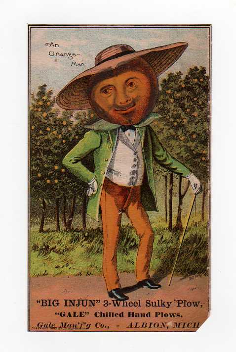
"An Orange-Man" と左上の空に書かれています。
そして、その3――

これが、同じシリーズなのかどうか、迷ったのですが、それは余白に "1st Premium Cabbage Head" とか "An Orange-Man" とか細い字体で書いていないからです。そもそもこの黒人はなにものなのか。
で、この王様の王冠を見ると、なんたら COTTON という文字が刻まれているのでした。LORD COTTON? 南部的イメジで、綿花だったのですね。
オレンジマンもそうですが、アンパンマンもびっくり、というところでしょうか。
(たぶんつづく)
![]() じゃないのかな・・・・・・
じゃないのかな・・・・・・ ![]()
村の時間――にほんブログ村へ新しいページでまいります。クリックをクリっとひとつよろしくお願いいたします。
お気に入りのリンク集
読んでいるブログ(RSS)

Watch Me Disappear さん
- Mucha-holic / ミュシャ中毒 03/22NEW
- ようこそ!子どもの本の森へ 11/22
- カリフォルニア時間 ホイ 12/24
- r2 08/03
- 小心者の杖日記 01/01
- EL30 04/11
- 不連続な読書日記 12/30
- Knights Templar Vault 09/26
- Critical Life (期限付き) 08/27
- 渡辺由佳里のひとり井戸端会議 04/12
- Frisco Freak 01/13
- 私の闇の奥 10/29
- 荒俣宏のオークション博物誌 05/25
- 窓@Berkeley 04/13
- 本を手に 02/22
- 勝手きままにグルメライフ♪w @時々旅行?!w 02/06
- japonisme 09/22
- traveling with the ghost (旧館 Old) 02/12
- Paint It Green × カリフォルニアGreen便り 09/07
- 村上なら春樹より龍 05/01
QRコード

つづきが楽しみ・・・♪
by あひるのドナちゃん (2008-12-24 14:47)
あひるのドナちゃんさま
新年おめでとうございます(一週間遅れですいません)。
勝手なブログの読者になっていただき感謝しております。
2009年がよい一年となりますよう願っています。
by verbum (2009-01-01 00:44)